Smartsheet Tip: Chart Changes
Introduction
This post started out as just personal documentation so I could recall later how I had done something. It kind of grew a bit from there.
Backstory: Recurring Widget Tasks
One of the task types I sometimes want/need to track is what I sometimes referring to as ‘recurring widgets’. This type of tasks may have an end goal by a date or by a completion of a certain number of things (‘widgets’). One of the things that differentiates this recurring task type from other recurring task types1 is that as soon as the task is finished, the second CAN begin (but usually does not). Often these may be associated with a goal.
Examples:
- Read 6 business management books per year
- Maintain 60 PDU‘s in a three year period.
- Lose 40 pounds2 this year
- Test one quarter of user-driven malfunctions on the simulator every year.
I look at the goals/tasks and spread them out into smaller reasonable goals. Read a book every other month, earn 5 PDU’s per quarter, lose 3.5 lbs per month, etc… Knowing the goal and the time frame gets me my run-rate or burn-rate.
The Chart (part 1)
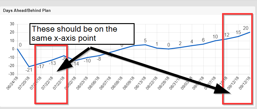
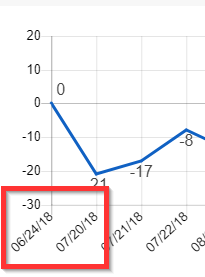
Today, I noticed something in my chart for one of these goals.
Any chart is telling a story. This chart was showing the change based on when a new item is added / removed from the total to be accomplished. Because I had completed more than one of these tasks today (2018-09-12) and back in July, the x-axis shows the multiple points in the sequence.
It also tells me that=Finish@row – [Actual Date]@row my burn-rate is something close to 5 (July change from -13 to -8 and September change 15 to 20 on the same day), but that requires extra brain power and it easier to just show the run-rate somewhere directly. I decided I wanted to combine all items achieved on the same day.
Change #1: A Consolidated View
Each of the tasks here are a separate row in Smartsheet. The task list is built using dependencies, with the predecessor’s lag representing the run-rate.
The columns of concern are:
- [Planned Date] – the start date for each task
- [Actual Date] – the actual date the task is completed
- [Date Diff] – formula
=[Planned Date]@row – [Actual Date]@row 3
- [Approved] – this task requires someone else to validate/test/approve it, so there is a check box to mark when it is officially complete.4
A Report is created to show all items that are marked [Approved].
To accomplish the consolidation by date, I add a new column
- [PDU Report] – and I’ll use this to determine the Report criterion instead of just [Approved]
The formula for this column is:
=IF(AND(Approved@row, [Date Diff]@row = MAX(COLLECT([Date Diff]:[Date Diff], [Actual Date]:[Actual Date], [Actual Date]@row))), 1, 0)
and I’m only going to discuss this part here5
[Date Diff]@row = MAX(COLLECT([Date Diff]:[Date Diff], [Actual Date]:[Actual Date], [Actual Date]@row))
If you haven’t embraced the COLLECT() function yet, you should add it to your list of skills to pick up.6
COLLECT will gather the range of [Date Diff] that has matching [Actual Date] on the row. For 2018-07-22, this includes range includes two number (-13 and -8). MAX(COLLECT()) will return -8. Finally, a check against the [Date Diff] on this row will be true if we are on the same row and false if we aren’t.
Now our Report will ‘weed out’ the extraneous numbers and the Report and Chart will be cleaner.
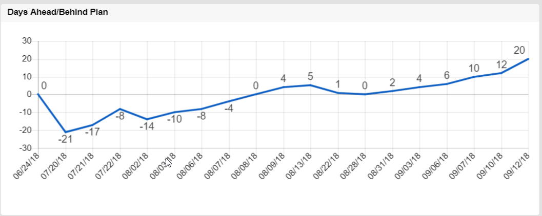
It is important to point out here that the numbers shown (for example -21 on 2018-07-20) are indicating that when the widget was produced/achieved on that date, it should have been done 21 days previously. The second widget achieved on 2018-07-22 should have been completed on 2018-07-14 (-8)
See also Update 2018-09-13 below.
The Chart (part 2)
While chart tells a story, there are other stories to tell. I decided I wanted to see a weekly progress, not a per item progress.
Change #2: A Weekly View
At this point, I need to make a decision. Because the solution will almost certainly involve column references, that means I can’t usually repurpose columns for other uses without running the risk of false-positives or circular references. The solution is either to create the area needed for the next chart in a different sheet using X-Sheet References or in another area on the same sheet, which likely requires new columns.
Because there are no new widgets being added to the list, I opt for adding the functionality to the same sheet and that’s the one I’ll show here.
Now the columns of concern are:
- [Planned Date] – I enter the first Friday of concern (2018-06-29) and then use predecessors of FS + 6d to populate all of the Fridays to the end of the year (when I expect to be done per my current velocity)
- [Actual Date C] – this column will be used to capture the last date from the current Friday that contains an item with the actual date entered.
=MAX(COLLECT([Actual Date]:[Actual Date], [Actual Date]:[Actual Date], [Planned Date]@row >= @cell))
- [Date Diff C] – the reason to grab the latest actual date is to retrieve the previously calculated [Date Diff] that matches that date.
=INDEX([Date Diff]:[Date Diff], MATCH([Actual Date C]@row, [Actual Date]:[Actual Date], 0))
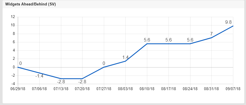
This shows both charts together.
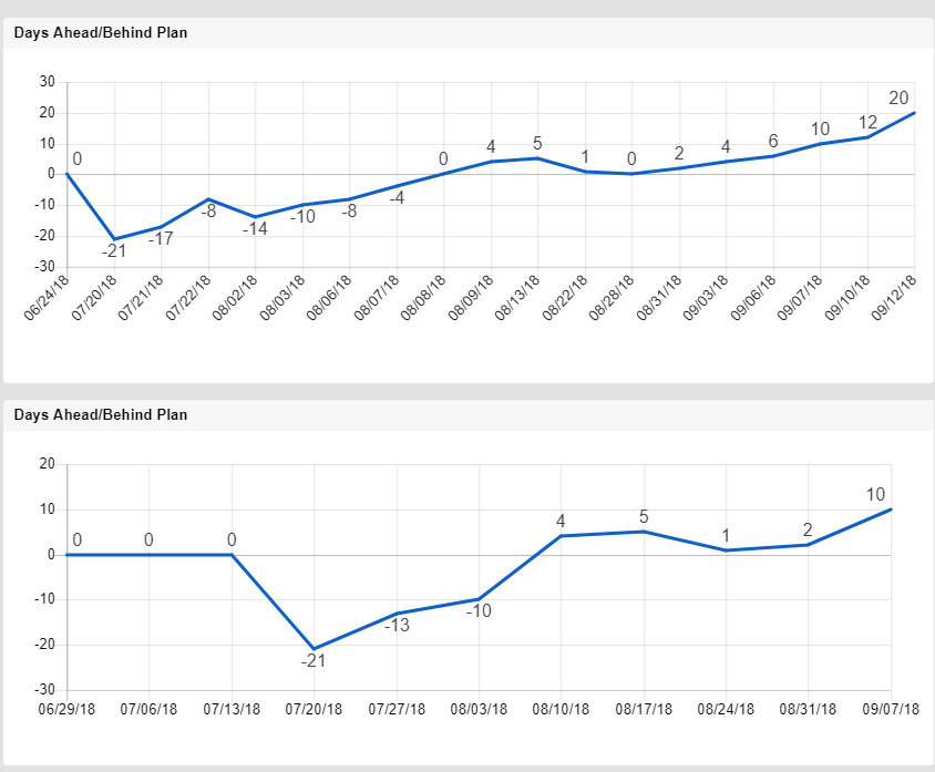
The top chart is showing each movement based on the day the activity occurred. The bottom chart is showing the activity based on each Friday.
The Chart (part 3)
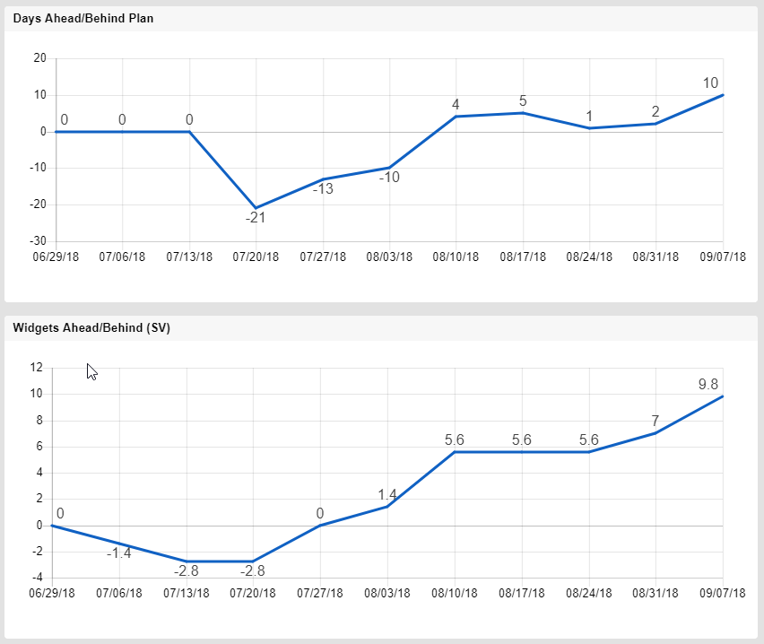
Uh-oh. What’s that?
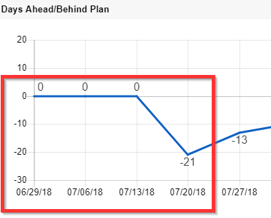
As I said earlier, each chart tells a story. This chart is highlighting a problem with the original chart — if there is no activity, the chart does not change, even when it should (maybe). Between 2018-06-24, when the first widget was achieved and 2018-07-20, when the second was, no activity resulted in not change. Put another way,
between 2018-06-24 nd 2018-07-19, this chart would have only one data point — and it was 0.
This does not make the charts wrong, but one must recognize the story it is trying to tell. I also deliberately chose this example because a burn-rate of 1 per 5 days result in different charts than ones that had a burn-rate of 1 per week.
Change #3: Schedule Variance
The previous charts were looking at activity dates, now we need to shift to three concepts from earned value management:
Planned Value (PV): The amount of work/effort that should be completed by a certain date, ie the planned accomplishment. In this case, with a run-rate of 5 days, that is equal to 1.4 widgets per week.
Earned Value (EV): The amount of work/effort actually accomplished by a certain date.
Schedule Variance (SV): The difference between the two.
SV = EV – PV
Positive is good — we’ve done more than we planned. Negative is bad — we are behind.
Three columns are added to capture these values.
[PV] – is just 1.4 per week
[EV] – counts how many widgets have been completed by the given Friday and multiplies by that 1.4 (because that is how much each is “worth”)
=7 / 5 * COUNT(COLLECT([Actual Date]:[Actual Date], [Actual Date]:[Actual Date], @cell <= [Planned Date]@row, Approved:Approved, 1))
Now we are only taking credit for the ones that have been approved.
[SV] – is just the formula =EV@row – PV@row
And the results show why PM’s think SV is a good thing to pay attention to:
And putting the two weekly views together, their stories are just different versions of the truth.
Closing Thoughts
For most of my personal goals, the first chart is sufficient. It gives me a quick visual indication of where I am (on 2018-08-03, I was 10 days behind the original estimate/plan) and where I’m going (after the initial delay7, the trend was ‘catching up’ and then ‘getting ahead’).
The added effort to add the second graph (a whole new section or separate sheet) is worth it if I need to see the weekly status, but is really only valuable if there is SOME progress, even a little.
If that were an issue, I’d likely go the next step and add schedule variance.
If you like this post, please “Like” it. People don’t tend to do that, but it hasn’t discouraged me yet.
If you have questions about this post, please add them below. If you have questions about something else in Smartsheet, post on the Community. I occasionally stop by to answer them and so do a lot of other talented people.
Update 2018-09-13:
I had hoped to avoid expanding the formula further used for Chart #1, but sometimes it will need to be a bit longer. Generally the tasks I track like this are done once in a while and then dormant for a while, until the next one comes along. I have one use case where the validation is outsourced and they just got back to me … with only some of the tasks approved, the rest will be reviewed later.
In this case, I went ahead and changed the formula part to this:
[Date Diff]@row = MAX(COLLECT([Date Diff]:[Date Diff], [Actual Date]:[Actual Date], [Actual Date]@row, Approved:Approved, 1))
to only collect the approved widgets, like I did in a later formula.
Update 2018-09-14:
This was removed from Chart #1 discussion:
- [P-Date] – since [Planned Date] is a project column (Date/Time, not Date), it will show up with the timestamp on the Dashboard’s Chart widget. I use =DATEONLY([Planned Date]@row) to ensure I get only the date for use on the Chart.
[P-Date] was originally part of the design, but the timestamp issue is not an issue on the Dashboard’s Chart widget, but is on the Smartsheet Labs Chart functionality. When I moved the Chart from my website to the Dashboard, I did not notice that. Now [P-Date] is used as a Reminder Date when no [Actual Date] is entered:
=IF(ISDATE([Actual Date]@row), “”, [Planned Date]@row)
The original title of this post included “Continuous Improvement” but I took it out because it did not fit the final content. Based today’s update, you might recognize that I believe:
- It is good to document processes. If the process or implementation changes, the documentation needs to be updated as soon as possible. And “asap” does not mean sometime later – it means the task is not finished until the documentation is done. I would like to say that I always live up to that ideal, but I don’t.
- Continuous improvement are not just buzzwords. Everytime I use a process, I may notice tweaks to make it slightly (or grossly) better. If time permits, that happens on the spot. If not, it goes on to the backlog. If I notice the same thing again next time through, I may tweak the priority a bit higher if I still don’t have time to fix it now. Or I learn to live with it and move it to a different list of “if I ever have unlimited resources”.
- An example of a recurring task that does not meet this criterion is mowing the lawn. I might expect to mow the lawn 13 times this year, but I won’t start as soon as I finish today, the “oh, time to mow the lawn” warning is not time based but something else (grass length), and if I have to mow 10 times or 20 times, the satisfaction criteria includes whether my girlfriend thinks I mowed it when it needed it.
- Weight, not GBP (£). That would not be a very good goal.
- This formula would uses [Planned Finish Date] if the duration for these tasks were longer than 1 day
- My assumption is that once I marked it completed (by entering a date in the [Actual Date]), it is effectively complete, but in some cases, I may track both.
- There are two other choices that I made here that are not necessary to understanding the main change.
- The first is using AND(Approved@row, …) — this could have been accomplished in the Report Builder instead here, but once I have the formula, it is actually easier to maintain if I bring that criterion here into the whole criteria.
- The second thing is using the IF( …, 1, 0) may imply to some user that I am using a Checkbox. I’m not. First, for checkbox formulas, I avoid using IF( (expression), 1, 0) completely as = (expression) accomplishes the same thing. Second, I am using IF( …, 1, 0) in a Text/Number column so that later I can have different Report criteria using the same column, when I use IF( …, 2, 0)
- If you are one who writes formulas for your Sheets.
- Delay caused by travel, but if this were a project chart, it would have an explanation readily available.
Write a Reply or Comment